MOTOR
Branding, Marketing, and Product Design
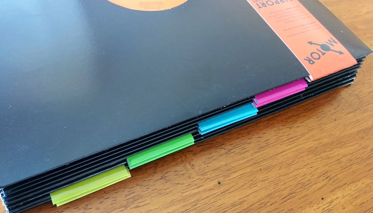
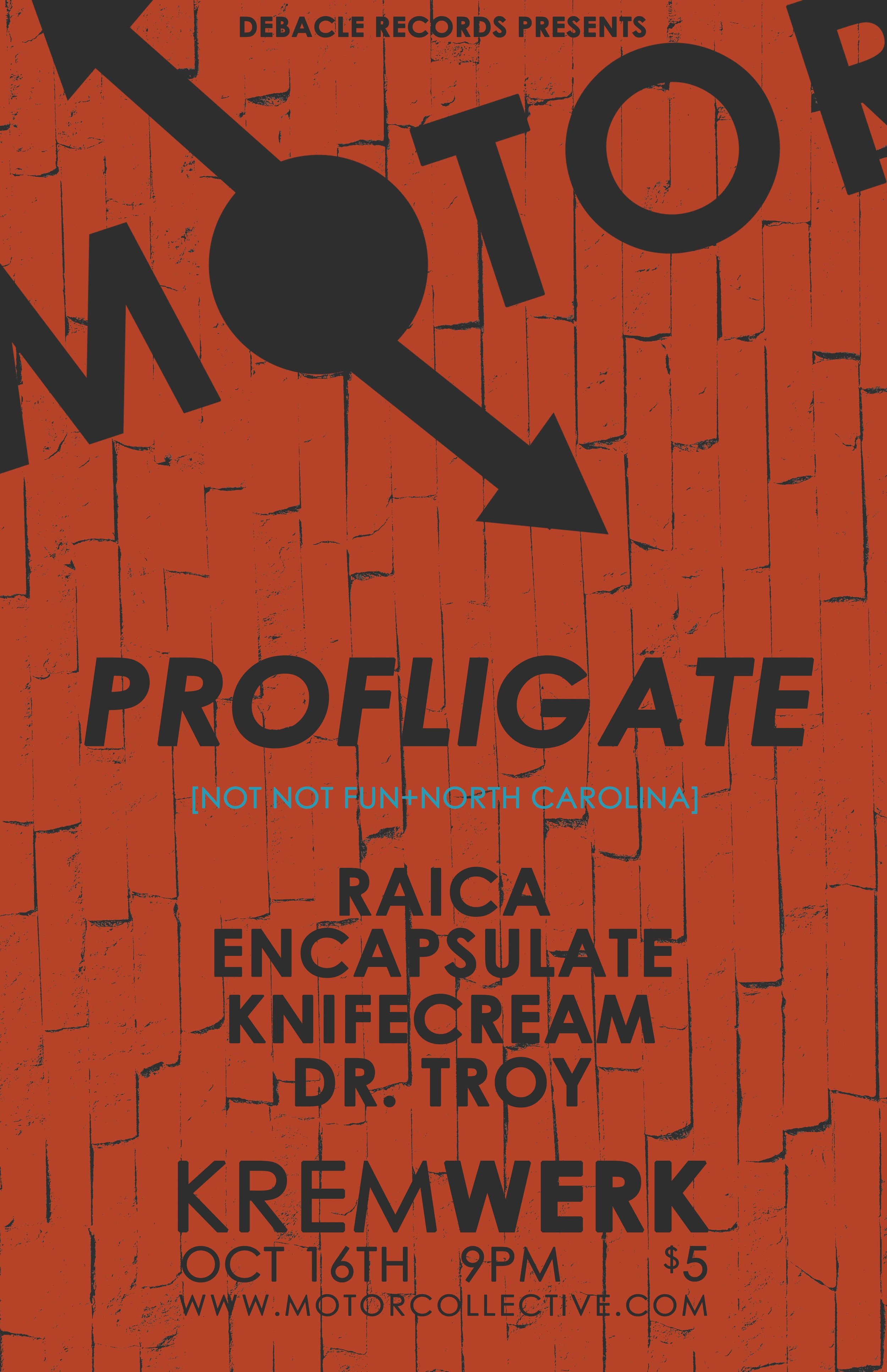
MOTOR was a long running club night and record label I ran with a huge group of supportive friends and artists. I was responsible for the branding and execution of merch, flyers, website and physical media. The brand evolved over time but always stuck to the hyper simple modernist place it started from. The bright red primary brand color and the arrows trying to evoke modernism and the arrows, slightly akimbo, evoking movement and spin of motors and propellers. The obvious reference to the motor city and the machine industrial rhythms that inspired German ‘motorik’. One of the most interesting design elements was how the brand was characterized by not only a set of colors and a logo but the exact order of those colors, or which colors touched each other. I do wish we had incorporated more of the lush PNW texture that could be found in the textures of the music. The messy haze. Towards the end the scrambled linework and the hazy photography I was playing with were an attempt to embody this.


